Many online casinos are utilising responsive design in their sites, but what does this actually mean? In the following article we will outline what this is and does for the site and the user. 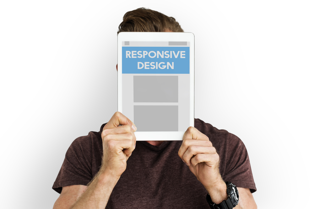 First, it is important to understand what responsive web design actually is. Responsive design is a way of designing the web site so that it responds and changes in response to the way that the user uses and behaves on the site. It takes into account the type of device that is being used, screen size, orientation and more. The way this is achieved is by designing the website using flexible layouts and images, and using the software programing tool CSS. All of this modifies and changes the way that the screen looks, to make it look optimal for the user no matter what screen size is being used. As technology advances and the ability to access Wi-Fi from anywhere in the world increases, players are using more and more different types of devices in order to access their favourite games. Because of this it is becoming increasingly important that websites can be viewed easily both on a large traditional laptop screen and also on smaller screens like that of a smartphone, or an intermediate size like a tablet or iPad from Apple. Players need to find this type of information, and a lot of it can be found at Casino Topsites Due to this increased demand for game play on smaller screens, casinos are now changing the way their websites are displayed, allowing customers the choice to play on any device type. The sites are becoming responsive so that the user can enjoy an easy and understandable interface, find the games they wish to play, and play them all on an easy and straightforward website. Responsive design is essential for attracting players to these sites.